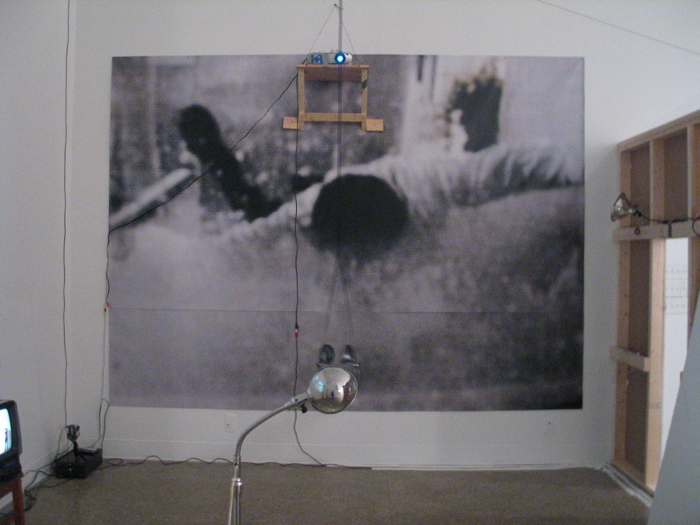
 Christopher Wiedeman’s installation Slip is a calculated mess- and he likes it that way. This mess occurs around a 9’x12’ poor-quality photograph (that looks like it was lifted from a video on the web) of a man falling face first into water that is pinned to the north wall of the space. Judging by the card for the show, the photograph, also titled "Slip", is the only piece in the installation, leaving the majority of the mess to act as apparatuses for viewing the image.
Working in the vein of John Kessler, Jason Rhoades, and Cece Cole, Wiedeman presents you with his mess and expects you to do the work of putting it together. Although I find this practice dubious, lazy, honest, suspect, and (the worst) intentionally self-confounding, I nevertheless think there is a fair amount of success in Wiedeman’s installation. The space is configured with multiple video cameras, video projectors, monitors, and mirrors so that Slip (the photograph) is made visible on three of the four walls of the space. The word SLIP is written on the piece of drywall that was cut-out to make one of the roughly hewn entrances to the space (the removed piece is set aside but still in the space, and unfortunately, the word does not become the image), the south wall bears a projected video loop (the artist stomping around his studio, a landscape or two, the artist photographing into a mirror). Key moments during the loop direct the viewers’ attention to the west wall, where a live feed of the viewer, shot from a video camera positioned on the south wall at eye level, projects the image of the viewer experiencing the installation (in front of Slip – the photograph- which is, remember, on the north wall) on the west wall. While noticing that you are standing before, and are being bared down on by the image of this man falling, it is noticed that next to the image of yourself watching the video on the south wall is a live feed of yourself being watched from above. Wiedeman directs where the viewer stands in the installation by dangling headphones (the audio for the video) smack in the center of the space. With the viewer’s movement restricted by the noose-like height and positioning of the headphones, the viewer is ripe to manipulate, ripe to direct.
Slip (the installation) was one of the only installations in the thesis show that explicitly dictated the way I viewed it (the other was Randy Toy’s this-is-the -way-the- future-looks- and-it-looks-good-for-me-doesn’t-it? installation Correlations). But what it didn’t do was provide me with any sort of ideas that would enable me to take the inundation of media to a level where constructive thoughts could be furthered. I found myself thinking: Yes…this is the way it is… yes… But is there any kind of conversation more boring? I already know what I think and I go to the work of others to question the way that I perceive the world, and to find another way of looking and thinking. Slip (the installation) is a blatant, insidious, and earnest attempt to surround, flood, force, and disorient the viewer while having them experience a slice of what it is to be alive in a culture that records, measures, weighs, and commodifies every activity we engage in. That’s a lot for an installation to do, and still, it’s not enough.
Tom Condon
 Unlike many of his fellow students, Tom Condon’s exhibit Everyday Haunting is comprised of two bodies of work. One body is made up of moderately sized (are they)drawings / (or are they)paintings / (they definitely can’t be) photographs made by passing a torch over strips of color photographic paper that has been stacked to make horizontal canvases. The other, are long, vertical photocopies, printed on approximately 10’x2’ sheets of white paper that have been treated with a clear encaustic.
Condon uses the torch to trace manipulated images he’s transferred to the surface. The images are of Condon and other children, taken from his childhood snapshots that he has manipulated with a copy machine so that in each image one character is made into a nearly indecipherable, genderless, ageless blob-freak. Although the turquoise and caramel colors that the flame creates when it reacts with the photo paper are attractive hues, I feel like I can’t be bothered with the pieces. They are messy, graceless, overworked, poorly framed, and make me think of entering a restaurant and being grossed-out by its dirty, fingerprint-smudged glass entrance doors. I feel like on the surface of these pieces there are sneezes, germs, and live active cultures!
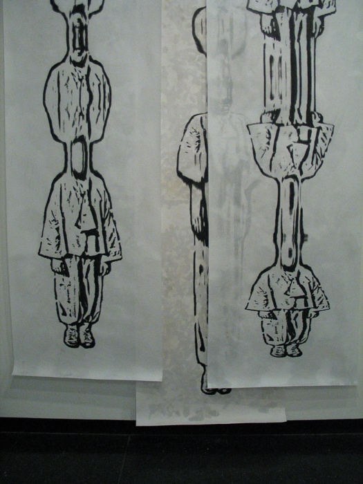
The pieces that make up Reading out Loud (ROL) are a whole different animal. ROL consists of 4 “photo copy encaustic(s)” each made on approximately 2’x 8’ sheets white paper that were hung vertically (and loosely with binder clips and nails) in the second gallery’s east wall, on the Anderson’s first floor. Three of the images were grouped together, and overlapping so that the three together bring to mind large swaths of fabric, or curtains. On the other side of the high, arched doorway the fourth image- sequestered from the others (not unlike Rafferty’s bubble video) hung lower than the other three. Knowing that Condon and Rafferty share a studio, I find the similarity between the two exhibits interesting- or even promising, not distracting or derivative. The imagery in ROL, like that in the work mentioned above is made from manipulating snapshots (in this case a single snapshot of Condon in a clown-like outfit of baggy ankle-cinched trousers and a poncho like blouse) with a black and white photocopier. But instead of the image being manipulated horizontally the image is stretched vertically and the images resemble funhouse-mirror reflections and make me think of how, as a child whenever I looked at myself in one of those mirrors I was happy that I didn’t look like my reflection.
The image, being black and white and photocopied, takes the work away from being merely solipsistic, but because of its goofiness, and because all we are left with is a psychedelic pattern, a funny outfit, a smile, and a bowl cut, the image might as well be a found photograph. This is problematic- nothing significant is conveyed in the face of this figure- that smile could mean a million things, but because of the quality it means nothing and is an empty and generic happiness that I am unwilling to believe. Like Land’s, and Wiedeman’s work, Condon’s leaves me wanting for some direction. With no direction, I’m left with thinking that the work is more a decorative exercise (which it does well) than an attempt to communicate. But still, I’m not convinced this is the point.
No comments:
Post a Comment